Brands
Below are a couple of examples of our recent work that incorporate branding. Most of them expand into other territories as well, like marketing, design, copywriting, straplines and slogans.
The Tennis Emporium
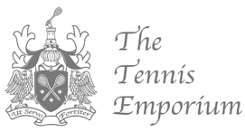
Initially we were called in by The Tennis Emporium just to design their logo but they must've taken a bit of a shine to us because now they use us for all their design work, product ideas, advertising and copywriting work.
Following on from the success of some viral videos we made for them, they also recently commissioned us to create their first QR Code campaign, which we are currently embroiled in.
Following on from the success of some viral videos we made for them, they also recently commissioned us to create their first QR Code campaign, which we are currently embroiled in.
The Tennis Emporium Video Links
The brief was to create a series of fun viral videos that made The Tennis Emporium more engaging and accessible to the internet generation and especially YouTube:
How Tennis Caused the World’s Financial Crisis:
http://www.youtube.com/watch?v=P2l2grvLUiQ
Unspeakable Filth
http://www.youtube.com/watch?v=r0iGpFAvllw
Uber Cool T-Shirts
http://www.youtube.com/watch?v=Af_fP3mt_TY
A Guide to Love:
http://www.youtube.com/watch?v=YXqvh9F8V_s
Tennis as Explained to a Beginner:
http://www.youtube.com/watch?v=zUHtAU7PPEY
eCourt
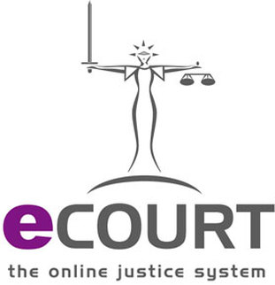
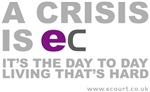
Again with eCourt we were initially only called upon to design a new logo and a company strapline. The logo is the one on the left and the strapline that we came up with was a play on the word "easy" using the first two initials of their name,
E & C, which gave us their slogan:
"For every tough dispute, there's an EC solution"
The slogan was so strong that they immediately hired us to create a three year advertising campaign, based around it. The first of which is due to launch as a poster campaign this autumn.
They were so taken with the campaign that they then also asked us to create a special eCourt shop so that they could monetize the campaign by turning it into a series of merchandising items and corporate accessories.
This we did by adding an extra page to their website. You can check out some of the designs on display in the eCourt shop below:
Take it Easy
I'm Easy
A Crisis is Easy
It's the Every Day Living That's Hard
Charity Booklet
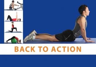
When the charity NASS ran into trouble for a catchy name for their new book on gym exercising, QReative Studios were able to quickly solve the problem. As NASS mainly specialize in disorders around the vertebrae and the spine, it seemed logical to incorporate the word back and the slogan "Back To Action" was born.
For more information on NASS, or about volunteering, or to simply donate to the cause, visit the website:
http://www.nass.co.uk/
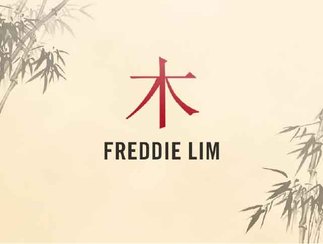
Lim Project #1
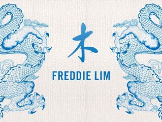
The brief was to come up with a design for the renowned Harley Street doctor Freddie Lim and his new range of rejuvenating lotions and specialist skin creams.
We played on his surname, Lim, which is Chinese for 'wood' and used the Chinese symbol for wood as starting point, and juxtaposed that against an iconic dragon symbol and coloured it using the classic blue and white colour used so profusely on their glazed bone china.
Lim Project #2
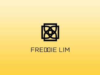
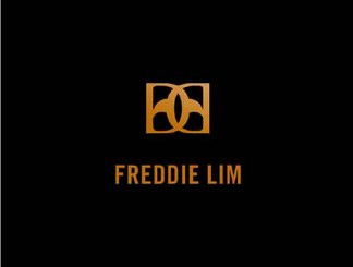
We also tried playing with the double DD configuration, both as a symbol and as a distinctive motif in the brand name and came up with a variety of designs, see the designs to the left and below.
Lim Project #3
Here we tried another design variation by taking all the letters in the name and merging them all into one symbol which could represent each letter. This we did but it lacked symmetry, so then we created a mirror image of it and interlocked the two designs.
Lim #4
Here we tried another design variation by taking all the letters in the name and merging them all into one symbol which could represent each letter. This we did but it lacked symmetry, so then we created a mirror image of it and interlocked the two designs.
As these skin care creams were to be marketed as top of the range products, as befitting the good doctor's status, they wanted it to be pitched along similar lines to the campaign that ran with slogans like, "reassuringly expensive" and “because you’re worth it” of the past.
So we came up with the tagline: "Invest in yourself."
For more examples see our portfolio on the Design page...
QReative Studios
"Helping your brand make a name for itself."
[email protected]
QReative Studios best for all your marketing and advertising needs, promotional campaigns, copywriting services, corporate branding, re-branding, logo designs, graphic designs, straplines, slogans, taglines, etc.
QR Codes - the ultimate guide to QR Codes; QR Codes explained; QR Codes made easy; QR codes eBook
QReative Studios
Unit 6,
Leysfield Road
London
W12 9JF
Tel: 07925 009 896
